Lensabl is a business specializing in providing prescription lenses. My team was tasked with creating a mobile app that featured an augmented reality eye exam for them.
Team: Kayla Fathi, Margaret Hanken, Peter Kim
My Role: Research Lead, UX Designer
Duration: 2 weeks
Tools Used: Sketch, Marvel, Trello, Adobe XD
The Challenge
Lensabl wants to create a way for customers to accurately measure their eyesight at home for modern, busy people.
The Solution
Allow users to complete eye sight exams from the comfort of the environment of their choice — done by designing a mobile app that utilizes Augmented Reality (AR) technology to get accurate eye exam results.
The Research
Conducting research was an iterative process through out this project. As the Research Lead, I gathered our insights into possible design recommendations, led usability testing of each stage of prototype, and conducted secondary research into the best practices of utilizing augmented reality in the medical realm and in apps.
Competitive & Comparative Analysis
We analyzed how existing apps have tried to conduct eye exams.
We saw trends in using a chat bot, using parts of the phone’s hardware, and those who we consider our top competitors have a distance detection system.
None of the existing apps use augmented reality in any form. This is when we really knew that what we were doing was groundbreaking in the realm of eye care.
Interviews
Interviews played a major role in our process. Our interviews ranged from discussing individuals’ current method of eye care and their pain points, to evaluative interviews focused on augmented reality. It was particularly enlightening to speak to eye care professionals.
“Will it be as accurate as actually seeing a doctor?”
“How fascinating!”
“I’d try it out.”
Affinity Mapping
We collaboratively arrived at research questions and synthesized what we learned in our 7 interviews by affinity mapping as a team. During our research synthesis we identified two major blockers users had with the idea of an AR app to be used for an eye exam: trust and accuracy.
Surveys
We utilized surveys to get a better feel for the demographic makeup of potential users, as well as to gain an understanding of people’s familiarity and comfort with augmented reality. We had 36 responses.
A key insight: our results showed a wide variation in confidence with AR. This variety was considered in our implementation of optional guidance videos and additional imagery.
How Confident are you with using AR?
User Persona
Based on our research, we created a user persona to determine the type of person we would be designing for. Meet Drew.
Taking a Step Back
I dove into scientific articles to better understand how augmented reality can best serve our purpose.
It was vital for our team to make informed choices in our use of AR technology and find ways to make it accessible to the average user.
What was particularly interesting was learning that eye exams have been done the same way for fifty years. This highlighted the need for a better, quicker, and easier examination for both doctors and patients—which lays the foundation for implementing AR.
Redefining the Problem
A key insight that led to the redefinition of our problem at hand was discovered through speaking to an optician.
When patients go to the optometrists for an eye exam, they also receive a pupillary distance measurement, that is the measurements between and around their eyes.
So to be able to fully discard the need to make the trek to the doctor’s office, we not only need to provide an eye sight exam, we would need to be able to address measurements as well.
The Design Ideation
From Web to Mobile
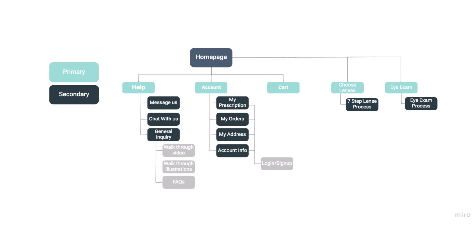
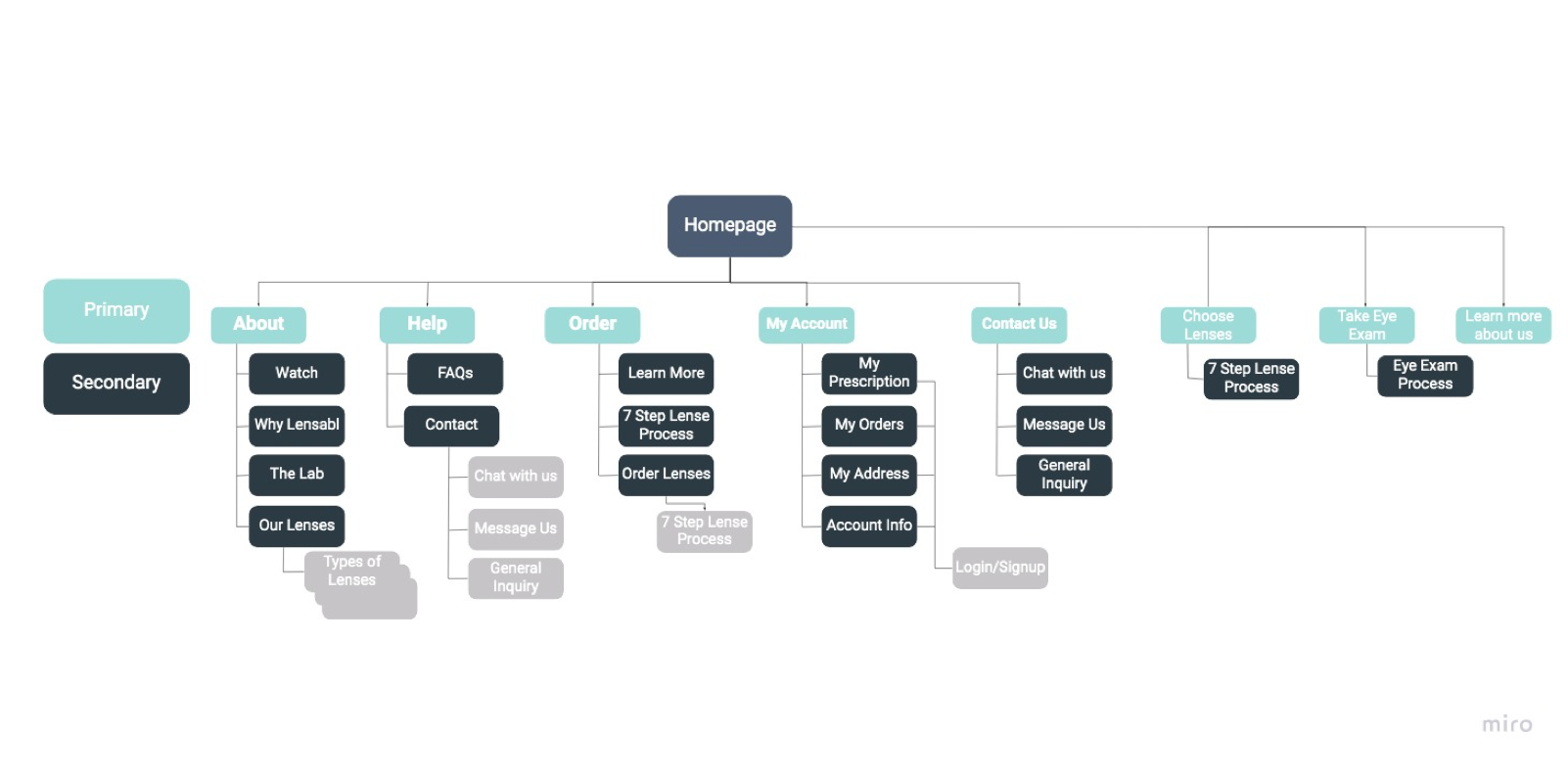
We conducted open and closed card sorting to inform our choices in the information hierarchy of our new app from the existing site. This process can best be highlighted with the two site maps. Swipe to see the original.
Feature Prioritization
By considering the product/market fit, pinpointing the problems, and identifying our goals, we were able to prioritize features for our app design using MoSCoW methodology.
Design Studio
We conducted design studios where we communicated our ideas to each other as a team.
It was here that we agreed upon the user flow, features like bottom navigation, and the use of carousels throughout the app.
Wireframes
Low Fidelity
The product of our time in the initial design studio was the first iteration of our paper prototype. We made our paper wireframes interactive by using the Marvel app, and we tested on five users.
One of our users stated: “Just because something is read doesn’t mean that it’s understood.” This proved to be a key moment for our design as it led to an emphasis in visual direction moving forward.
What we did with what we learned from users:
Included visual icons through out the app.
Introduced the option to view an instructional video of the process.
Removed the global navigation from the exam portion.
Medium Fidelity
The medium fidelity prototype was made with the intention of better communicating our designs and to gauge the users reaction to our information architecture.
What we did with what we learned from users:
Included the option to pay with insurance
Moved the checkout process to take place after the eye exam
Clarified terminology in buttons
The Prototype
The insights gained through our research and usability testing have resulted in the latest form of our prototype—check it out.
Users go through detailed instructions of what to anticipate for the eye exam through our step-by-step carousel. For those that would like further clarification, there’s a video to see how it’s done.
An initial scan of the user’s face takes their pupillary distance measurements using the front-facing camera. The back camera is used to find a surface to portray the eye chart. The distance detection system utilizes the two cameras throughout the exam.
An audio recording of their responses will be sent to an optometrist to verify the results. Users will choose their desired form of payment, and have the option to have a live chat with a doctor.
Reflections
This project really reinforced the importance of teamwork. We shared late nights, long conversations, and a determination to create something we were proud of.
I would like to further explore the potential positive impacts of augmented reality in apps, and how, in a broader scope, a concept such as a mobile eye sight exam could increase accessibility and provide help for people on a larger scale.


